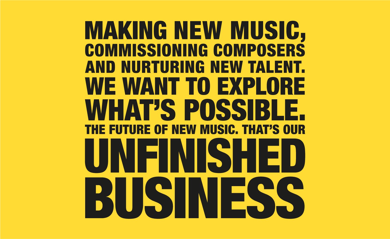
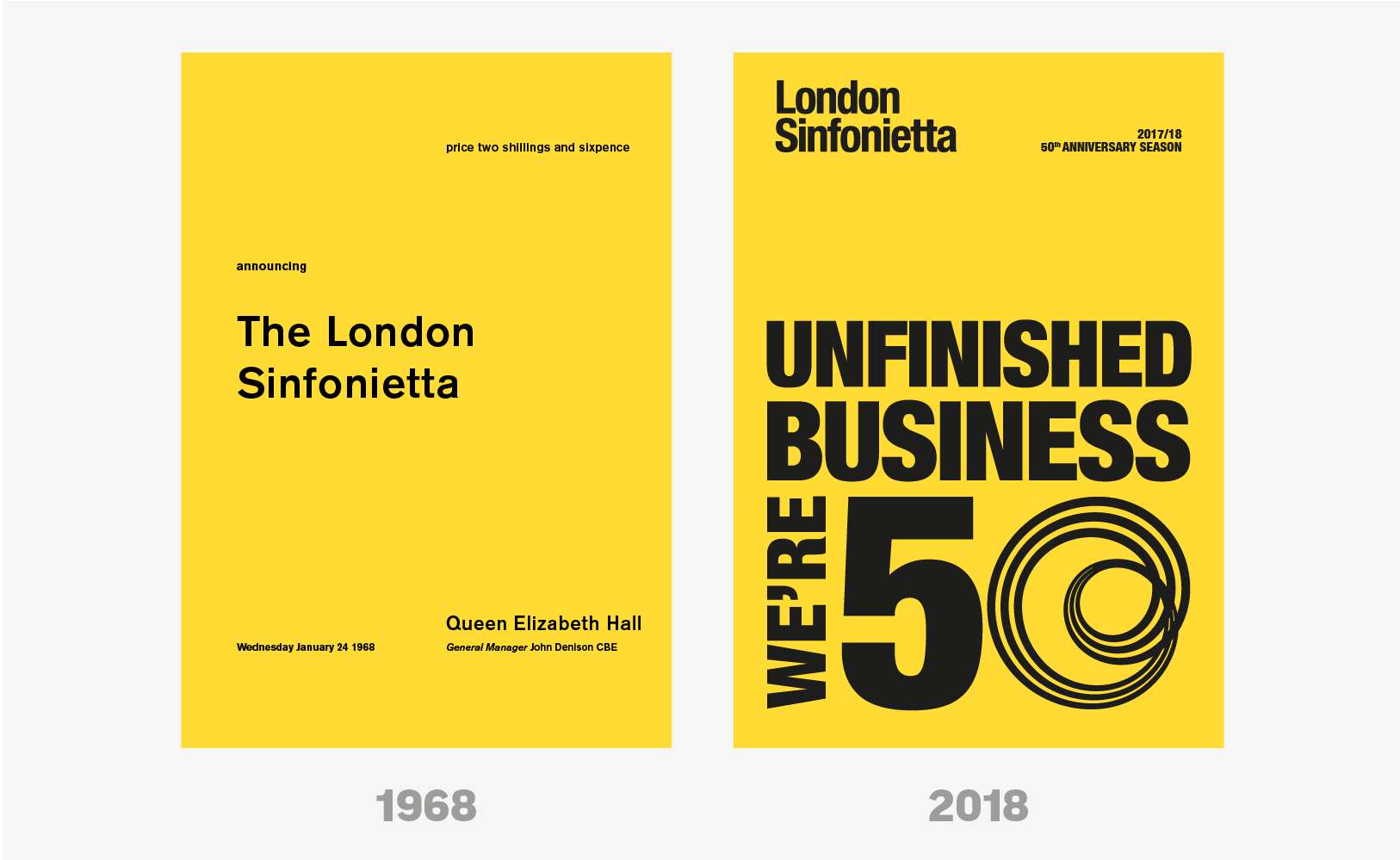
LONDON SINFONIETTA’S 50th ANNIVERSARY
Helvetica Condensed? Uppercase? Set solid? Tight letter spacing? Solid black on Pantone 116? Our design for London Sinfonietta’s 50th anniversary season goes all shouty and manifesto(y) with a visual nod back to their first season brochure in 1968, which was all yellow with a bit of black type. The future’s bright for this ensemble.